Happy-ish March folks. Back again for another #Authortoolboxbloghop. I’m sure we’re all stuck in our houses and maybe going a little stir crazy. Sending be well vibes out into the universe. I hope you’re all feeling okay and trying to weather this storm as best you can. After taking last month off, I came back with a topic that is near and dear to my heart.
Covers.
For me they make or break the decision if I want to move forward with reading a book. Like with books that people enjoy, what makes a “good” cover can be subjective. Beauty in the eye of the beholder and all that jazz.
I’ve seen some covers that have given me pause and made me wonder “what in the world were they thinking” and there are others that make me say, yes, let me learn more. This is not a “shaming” blog post by any means. Instead, I’m going to point out things that *to me* are things I consider when thinking of covers.
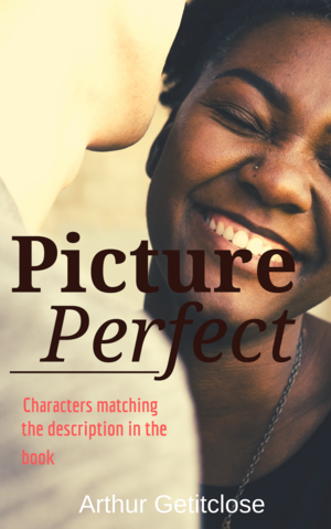
Characters matching description in the book
Worse if you have a character that is of an ethnic background, don’t have two non-ethnic models on the cover. If you’re lead is a “curvy” gal or guy, why is the cover model not reflective of that?
And I get it, finding decent stock photos is HARD!!! I wrote an interracial romance. Black man, white woman. Finding romantic stock that depicted that, in a way that represented my characters, didn’t happen. Because of that limitation, I had to go a different direction with the cover of my book. One thing I wouldn’t compromise on, hair color. My female had red hair, the model picked needed the same.
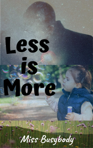
Keep it simple
When you’re thinking about what you want to represent your book, think of something important from the story. Can that be pulled to put on the front? What is the feel you want your cover to give off when people look at it? List out your top three to five things and pick two, max to focus on for the cover.
I write romance, when people look at my two covers, they don’t scream romance. Having your covers reflective of your chosen genre is important, but I also feel having it reflect your story to be equally important. My hope in having my covers designed was that after people read them, the mood and meaning behind the cover became clearer. For Fiendish, I wanted the dark, gothic-ish feel because the story is darker in nature. Not Broken was the next step, it was about a new day, and the picture is relevant to a part of the story.
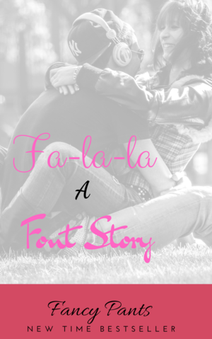
Font choice
I updated the cover of my first book, Fiendish, for a few reasons and font choice was one. I’ve learned a lot from when I first published that book to now. While it is legible for the most part, I knew the fonts can be cleaner. Plus, I’m working on branding, so I want my author name across all my books to be the same. Something else to consider. Even if your title fonts change, find a font that you love for your author name and keep the same style across the board.
As an indie, all upfront costs are on your shoulders. People say editing and covers are where you should spend your money. Everyone’s budget is different so what might be inexpensive for one, could be a stretch for another. Because of that, outsourcing your covers may not be an option. Don’t worry there’s help for that.
If you’re going to make your own, there are sites like Canva that can help folks like me that aren’t techy or artistically inclined. It’s free to use, has templates and is a good place to start, for ebooks at least. Finding images are important, but be careful. Don’t just Google something, you don’t want to get caught up in a legal issue for using a copyright image.
There are free sites like Pixaby and Unsplash that offer royalty free, common use images for no cost, or you can buy pictures from any of the dozens of stock sites. Canva also offers free and low cost images. FYI all the mock covers shown were made by me in Canva using images from the site. There’s a reason people say don’t judge a book by its cover, because people totally do. It’s the first thing potential readers will see. Before the blurb, before the first look at the online retailers, it’s the cover. You want yours to draw readers in. Now, I’m no expert, this is simply my humble opinion, but I hope it will help you in your future endeavors.
Until next time
~Meka
That first one, it's hard to read the title since it blends. The title should really stand out, not blend with the cover image.
ReplyDeleteYes! I agree. Another pointer on what to think about when designing the cover. :) The title and author name should be easy to read.
Deletethanks for stopping by.
Interesting point about branding and fonts. Thanks. I learned something. :-)
ReplyDeleteAnna from elements of emaginette
Thank you! I'm always learning and realizing new things and it's the little details that seem to matter at times.
Deletethanks for stopping by
Nicce blog
ReplyDelete